
In today's data-driven business landscape, data visualization is emerging as a necessary tool that converts data into visuals, making it easier for businesses to understand, process, and make important decisions. Data visualization helps in designing actionable insights. There are numerous data visualization tools available that are versatile, easy to use, and allow the user to visualize data in a variety of ways that suit their business needs.
A recent Fortune Business Insights report highlighted that the data visualization market in the year 2019 was estimated at $8.85 billion, and by 2027, it is expected to be $19.20 billion at a compound growth rate of 10.2% annually.
By harnessing the power of data storytelling, businesses can drive impactful narratives with comprehensive data visualization tools.
What is Data Visualization?
Data visualization involves the process of graphical representation of data in a visual form like graphs, charts, and maps. The tools enable users to generate insights from data easily, thus assisting them in making data-driven decisions. By representing data in a visual form, data visualization makes data accessible and easier for the user to understand.

Data presented through visual elements are easy to understand and analyze. This assists in the effective extraction of actionable insights, enabling organizations to use the findings for efficient real-time decision-making. Data visualization tools support streaming data, AI integration, collaboration, interactive exploration, and self-service capabilities to facilitate the visual representation of data. There are different data visualizations, but some of the common ones are bar graphs and line graphs, pie charts, scatter plots, tree charts, mind maps, timelines, and project evaluation and review techniques or PERT charts.
Read more: What Is Text Analytics? Tools, Examples, and Applications
What Are Data Visualization Tools?
With data becoming increasingly important for everyday decision-making, organizations are incorporating measures to understand how important data is while making crucial decisions. For the same reason, data visualization is capturing people's attention. Modern data visualization tools are advanced software used to visualize data. While the features of each tool vary, at the very basic, they allow the user to input a dataset and graphically alter it. Many tools also have pre-built templates for creating simple visualizations.
Some of the best data visualization tools available in the market are Google Charts, Tableau, Datawrapper, Microsoft Power BI, etc. These tools support the users with a variety of visual styles that are simple, easy to use, and capable of handling a large volume of data.
Discovering the Best Data Visualization Tools
With the plethora of technologies available in the market for data analytics and visualization, all the available tools have something or other in common. The first advantage of the tool is its simplicity in use. Some include good documentation factors and tutorials, while others are constructed in user-friendly ways. Others, irrespective of their other qualities, fall short in certain areas. However, the one thing to ensure is that the data visualization software is capable of handling large amounts of data.

With the right software, organizations can also generate a variety of bar charts, graphs, and maps. Many data visualization tools in the market specialize in different styles of charts or maps and excel at them.
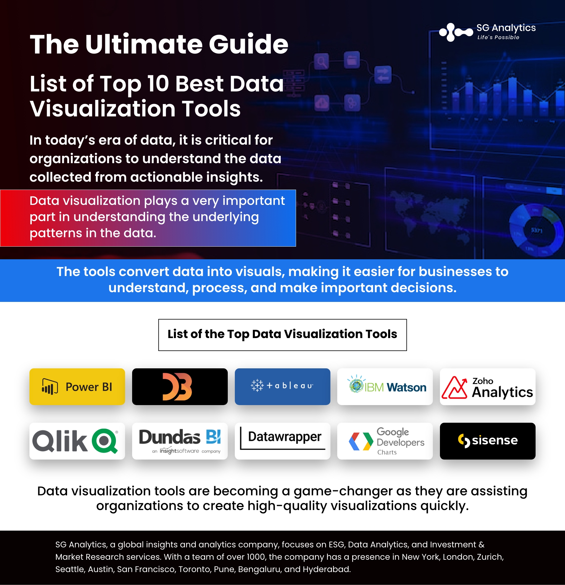
List of the Top Data Visualization Tools
-
Microsoft Power BI
-
D3.js
-
Tableau
-
IBM Watson Analytics
-
Zoho Analytics
-
Qlik Sense
-
Dundas BI
-
Datawrapper
-
Google Charts
-
Sisense
-
Microsoft Power BI: Best tool for Business Intelligence (BI)
A business scientific apparatus, Microsoft Power BI, makes it easy for businesses to break down their data and structure procedures outwardly. It offers the user entrance to on-premises and in-cloud information. The tool also has two valuing plans. The Power BI Pro makes it one of the best among all data visualization tools. It holds the capability to deliver live information with full intuitiveness as well as share information inquiries.

Microsoft Power BI Features:
-
With the tool, the user can manage reports by using a SaaS solution.
-
Power BI offers users real-time updates on the dashboard.
-
The tool provides the user with a secure connection to the data sources in the cloud.
-
The tool allows data exploration with the use of natural language queries.
-
It also offers features for dashboard visualization.
-
Tableau Desktop: Best for interactive chart
Tableau Desktop is considered one of the best data visualization tools that make the user see and comprehend the information by joining data from product sources. With the tool, the user can make intuitive and adaptable dashboards with custom channels. It is accessible in the work area, on the web, as well as in administration releases. The user can rapidly import data and dashboards to Tableau on the web and the server. The tool also has a copious of online video instructional exercises, making it easy to use.

Features:
-
The tool has moderate speed with options to optimize and enhance the progress.
-
It offers the user extensive options to secure data.
-
The tool has different versions, like the Tableau server, cloud, and desktop.
-
Tableau can be integrated with 250+ applications.
-
The tool assists the user in resolving big data-related issues.
Read more: Business Intelligence vs Data Analytics: Understanding the Critical Differences
-
Zoho Analytics: Best tool for Zoho users
Zoho Analytics is a business information investigation platform that uses an assortment of apparatuses, incorporates KPI gadgets, and unthinkable view parts, enabling users to generate reports. Previously known as Zoho Reports, the tool advances joint effort, thereby enabling clients and their associates to cooperate in report improvement. The arrangement lets clients incorporate different reports or dashboards in their applications and websites. Application designers and engineers can profit by using the tool as it enables them to integrate and fabricate systematic abilities into their foundation. Zoho Analytics permits the user to find a workable pace, including firsthand, at no expense.
Zoho Analytics Features:
-
The tool offers a wide variety of visualization options, including charts, pivot tables, KPI widgets, and custom-themed dashboards.
-
It is a unified business analytics platform for visualizing data from business apps.
-
The platform offers 200+ readymade connectors for popular business apps and databases.
-
White-label BI portals and embedded analytics solutions.

-
QlikView
An item relationship of Qlik, QlikView is one of the quickest-developing business insight data visualization tools and visual instruments. It offers users Associative Search, which lets them center around the most critical information at whatever point and place they require. The tool delivers a continuous joint effort with collaborators and accomplices, along with a relative investigation of information. This enables the user to consolidate relevant information into a single application. Additionally, the tool also ensures that only the individuals of the association can approach the data through stable security highlights.
-
D3.js
D3.js, or Information Driven Documents, is the primary and widely used data visualization tool. It uses HTML, CSS, and SVG to render astounding graphs and charts. With the tool, the user can envision any perception. It is a highlight-stuffed and intelligence-rich tool among the top free data visualization tools. It has a decent exhibition that grandstands what's probable with D3. However, there are two significant concerns with D3.js - the tool has precarious expectations of learning and adapting, and it is perfect with current programs. Therefore, its use gets restricted to when the user has enough time and is not worried about showing the outlines on more seasoned programs.
-
IBM Watson Analytics
Watson Analytics is IBM's cloud-based investigation administration that enables users to discover experiences in their information rapidly. It is considered one of the top free tools. When the user transfers their information on Watson Analytics, the tool shows the inquiries it can assist them with answering and furnishes the information perceptions in a split second. The user can investigate the information through normal language handling. Its other vital highlights include robotized prescient examination, a single tick investigation, information disclosure, open progressed examination, and self-administration dashboards. Watson's investigation offers intellectual figuring, thereby extracting increasingly intelligent data from the information.
Read more: The Future of Business Intelligence: Top Trends for 2023 and Beyond

-
Dundas BI
Dundas BI offers users highly customizable data visualizations dashboard and interactive scorecards, maps, gauges, and charts. It helps the user in optimizing the creation of ad-hoc reports with full control over visual elements. Dundas BI aids in simplifying the complex operation of inspecting, transforming, and modeling datasets.
Dundas BI Features:
-
With the tool, the user can visually prepare and transform their business data into reports.
-
The tool provides an extensive range of layout options for the user to choose from.
-
The user can customize interactive charts and maps.
-
It helps in incorporating data through an intuitive drag-and-drop facility.
-
The tool supports a wide range of statistical formulas.
-
Users can connect, interact, or analyze the data on any device.
-
The tool has an API that enables the user to enhance their design requirements the way they want.
-
Datawrapper
An open-source tool, datawrapper enables the user to create interactive charts. The user can load CSV (Comma-separated Values) data files and embed maps onto their website. Datawrapper is a very easy-to-use and the best tool to make representations such as infographics, information tables, maps, and responsive graphs. Considered one of the simplest Data Visualization tools, it can be integrated easily by the user.
Datawrapper Features:
-
The user can customize the app without any code.
-
Datawrapper supports Linux, Windows operating systems, and Mac.
-
The tool is one of the best free data visualization tools that helps users in creating maps, charts, and tables.
-
With the tool, user can connect their visualization to a Google Sheet.

-
Google Charts
Google Charts is an interactive cloud service assisting users in generating graphical charts from the supplied information. The tool can be used to create a simple line chart or complex hierarchical tree. Deemed one of the major partakers in the data visualization market space, Google Charts is famous for its capability to create graphical and pictorial data visualizations. The tool offers Zoom functionality and equips users with unmatched cross-platform compatibility with iOS, Android, and earlier versions of the Internet Explorer browser.
Features:
-
It has a rich gallery of interactive charts.
-
The user can configure charts the way they like.
-
The tool supports numerous web browsers.
-
The user can control charts from the dashboard.
-
Connect the data in real time.
-
Sisense
A data visualization software, Sisense enables the user to simplify complex data from different sources. It is regarded as one of the best data visualization tools that transform data into actionable, applicable components or visualizations.
It is a business insight stage that visualizes the insights required to settle on better and increasingly intelligent business choices. It can be used as a coordinated review program for an extensive range of information perceptions. Dashboards and graphical representations can also be created with Sisense's intuitive user interface. The Sisense bundle incorporates adaptable organization-based estimating, along with moment specialized, assisting users with the arrangement, tremendous scope without using any extra highlights, continuous patterns, information following, and mixed capacities.
Sisense Features:
-
The tool assists the user in mashing up data and creating an analytics app.
-
The user can embed analytics with a customizable feature.
-
The work can be deployed on the cloud using Windows or Linux.
-
The tool also enables the user to specify access rights to users.
-
The data can be recovered anytime and safeguarded against errors.
-
The tool offers a drag-and-drop user interface.
-
The user can export data to Excel, CSV, PDF, and other formats.
Read more: An Ultimate Guide: Business Intelligence in Data Analytics
Final Thoughts
In today's era of data, it is critical for organizations to understand the data collected from actionable insights. And data visualization plays a very important part in understanding the underlying patterns in the data. Data visualization tools are becoming a game-changer as they are assisting organizations to create high-quality visualizations quickly. With data visualizations, they can-
-
generate intelligent business insights
-
explain data in an engaging manner
-
identify industry trends in datasets spanning over a long period
-
understand complicated datasets
And with data visualization, teams can also design beautiful and descriptive bar charts, line charts, scatterplots, and geographical maps to convey the information that normally would be presented on spreadsheets or text reports to understand the data.
With a presence in New York, San Francisco, Austin, Seattle, Toronto, London, Zurich, Pune, Bengaluru, and Hyderabad, SG Analytics, a pioneer in Research and Analytics, offers tailor-made services to enterprises worldwide.
A leader in Data Visualization services, SG Analytics focuses on unlocking the power of data with our comprehensive suite and empowers organizations to gain valuable insights, make informed decisions, and drive growth. Contact us today if you are looking to make critical data-driven decisions to prompt accelerated growth and breakthrough performance.
About SG Analytics
SG Analytics is an Industry leading global insights and analytics firm providing data-centric research and contextual analytics services to its clients, including Fortune 500 companies, across BFSI, Technology, Media & Entertainment, and Healthcare sectors. Established in 2007, SG Analytics is a Great Place to Work® (GPTW) certified company and has a team of over 1100 employees and has presence across the U.S.A, the U.K., Switzerland, Canada, and India.
Apart from being recognized by reputed firms such as Analytics India Magazine, Everest Group, and ISG, SG Analytics has been recently awarded as the top ESG consultancy of the year 2022 and Idea Awards 2023 by Entrepreneur India in the “Best Use of Data” category.